Research
Data and mathematics empower us to understand the world around us, revealing hidden patterns through the lens of visualization. I invite you to explore my research at the interface of cartography, computational geometry, and spatial statistics. Dive into the sections below to learn more about my ongoing scholarly work.
Cartography
Geographic maps are a popular means to visualize spatial data, but they inevitably distort the curved shape of the earth. Consequently, the job of the cartographer entails finding creative approaches to represent geographical information despite this limitation. One such approach is the cartogram, a map that displays geographic units (e.g., continents) with areas proportional to a statistical quantity that is additive for its sub-units (e.g., countries). For instance, the map in Figure 1 represents countries with areas proportional to their population. Hence, India and China alone—the world’s two most populous countries—occupy 35.4% of the cartogram’s area, whereas Russia appears significantly smaller than on conventional maps despite occupying a larger land area.
Cartograms have often been criticized for being difficult to read. Additionally, their creation has required specialized geospatial programming skills. I am developing cartogram algorithms and software that aim to address this issue and make cartograms more accessible to a broader audience. For this purpose, I have initiated the go-cart.io project, which aims to provide a user-friendly web interface for creating cartograms. The project is still in its early stages, but I am excited to share more details as it progresses.
Selected links:
- go-cart.io
- cartogram-cpp: Cartogram generator in C++
- GitHub repository for cartogram web visualization repository
Selected publications:
- Fung, K. L. T., Perrault, S. T. and Gastner, M. T. (2024) Effectiveness of area-to-value legends and grid lines in contiguous area cartograms. IEEE Transactions on Visualization and Computer Graphics, 30(8), pp. 4631–4647. Available at https://doi.org/10.1109/TVCG.2023.3275925 and the author’s website.
- Duncan, I. K., Tingsheng, S., Perrault, S. T. and Gastner, M. T. (2021) Task-based effectiveness of interactive contiguous area cartograms. IEEE Transactions on Visualization and Computer Graphics, 27(3), pp. 2136–2152. Available at https://doi.org/10.1109/TVCG.2020.3041745 and the author’s website.
Computational Geometry
Computational geometry is the science of designing algorithms for solving problems related to shapes and spatial structures. My interest in this field was triggered by the construction of cartograms, which poses many intriguing geometric challenges. While various algorithms exist for creating cartograms, my primary focus has been on map-projection-based methods.

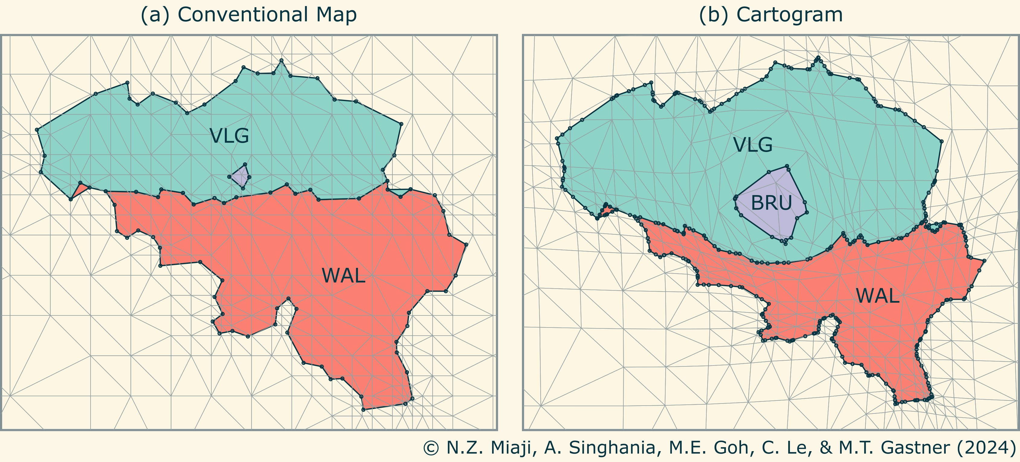
Figure 2 illustrates the transformation process. The gray lines in panel (a) depict a triangulation of conventional geographic space. This triangulation is adjusted by a map projection in panel (b) such that the areas of the colored polygons are proportional to population. As the areas are stretched or shrunk, the region boundaries need to bend around each other to ensure that polygons do not overlap or self-intersect. To ensure the correct curvature, the polygons in (b) require the insertion of additional corners, represented by black points. Determining suitable locations for these insertions is one of my current research interests.
Selected publications:
- Miaji, N. Z., Singhania, A., Goh, M. E., Le, C., & Gastner, M. T. (2024). Topology-Preserving Line Densification for Creating Contiguous Cartograms from Density-Equalising Map Projections. AsiaCarto 2024, Hong Kong. (Accepted)
- Gastner, M. T., Seguy, V. and More, P. (2018) Fast flow-based algorithm for creating density-equalizing map projections. Proceedings of the National Academy of Sciences, 115(10), pp. E2156–E2164. Available at https://doi.org/10.1073/pnas.1712674115 and the author’s website.
Spatial Statistics
Spatial statistics aims to understand the variability of distributions across space, such as population, disease incidence, or pollution. These data are often aggregated in enumeration units like countries or provinces. A common task is to interpolate these data to create a smooth, continuous spatial distribution.

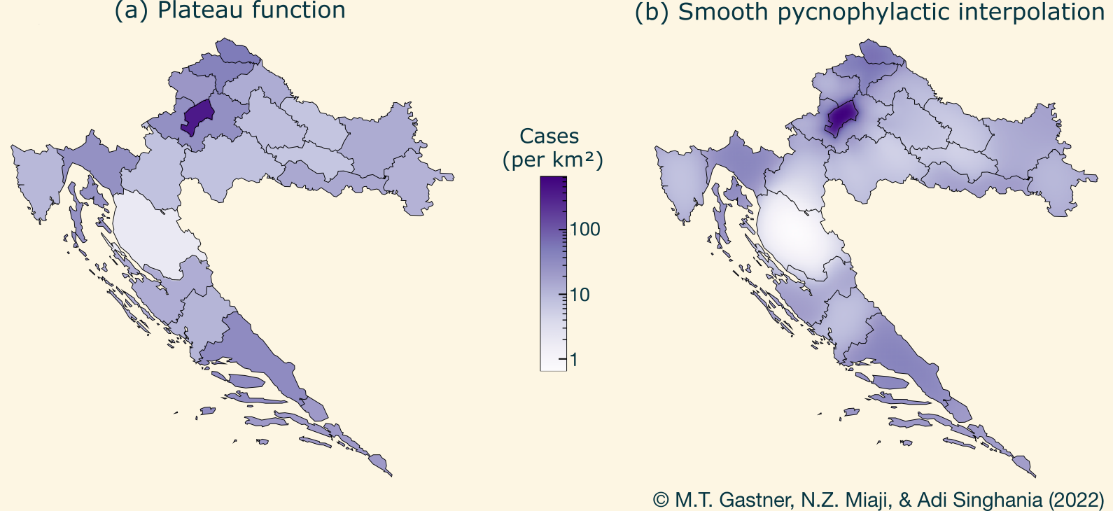
For additive data, such as the number of COVID-19 cases, smooth pycnophylactic interpolation infers the underlying continuous distribution. This technique finds a smooth, nonnegative density such that the area integral over each enumeration unit equals the observed cumulative data. It improves on the conventional assumption that data are piecewise constant within each unit, which causes unrealistic sharp density changes at boundaries, as depicted in Figure 3(a). An example of smooth pycnophylactic interpolation, applied to COVID-19 cases in Croatian counties, is illustrated in Figure 3(b).
Most current geospatial software implements smooth pycnophylactic interpolation through a cellular automaton algorithm (Tobler 1979), but the computation is slow and does not scale well to large data sets. My research group developed a faster algorithm by linking pycnophylactic interpolation to density-equalizing map projections. Future work will focus on further accelerating pycnophylactic smoothing using harmonic analysis.
Selected publications:
Gastner, M. T., Miaji, N. Z. and Singhania, A. (2022) Smooth pycnophylactic interpolation produced by density-equalising map projections. Cartography and Geoinformation (Kartografija i Geoinformacije), 21(37), pp. 60–69. Available at https://doi.org/10.32909/kg.21.37.3 and the author’s website.